

Dyne Technologies
B2C Foodtech: Reducing drop-off by 23% using patterns from Instagram's post creation flow
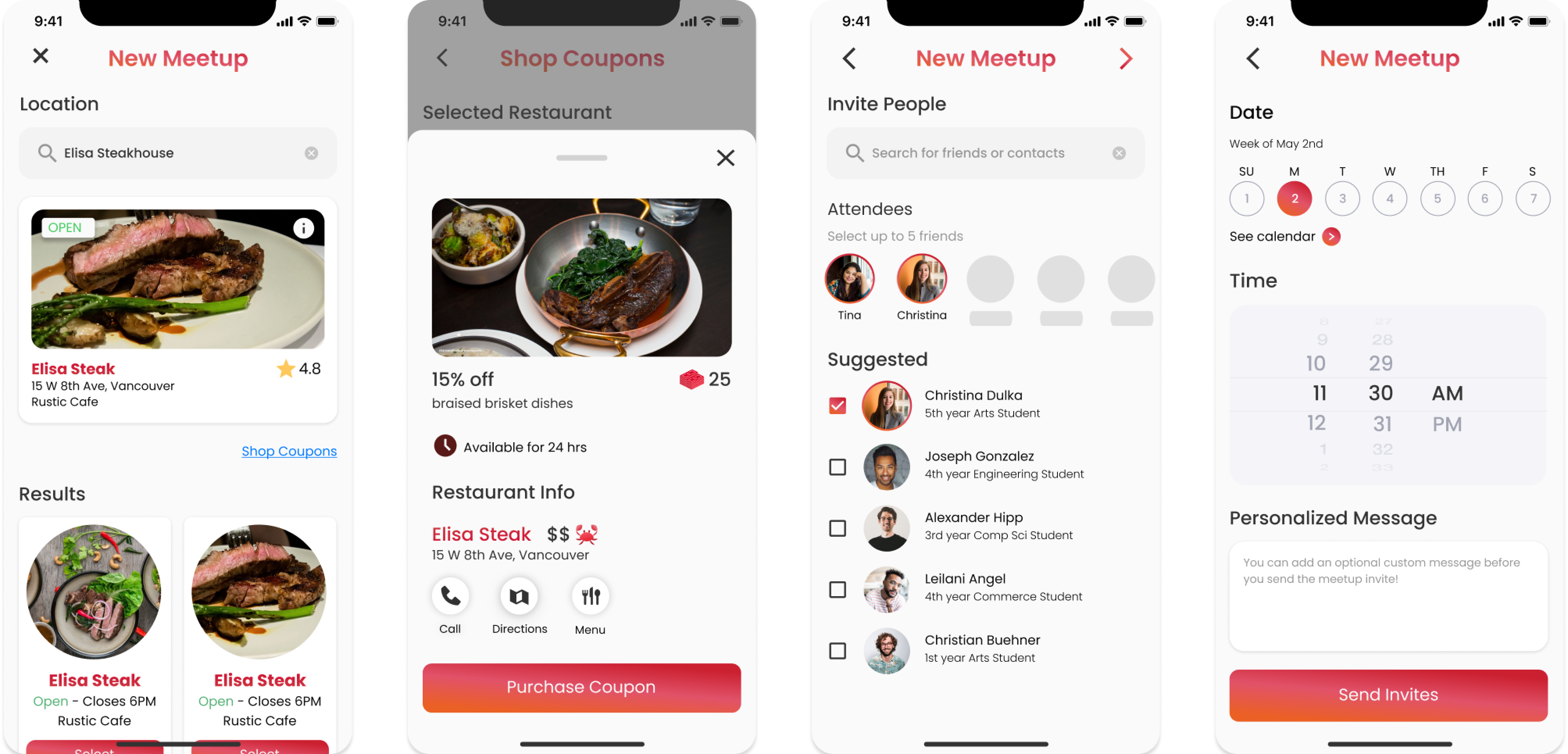
Meetup creation was a key feature in Dyne's B2C app, letting users reserve tables at partner restaurants and unlock exclusive deals. Despite its value, the feature suffered from low adoption and high drop-off. This redesign was part of a broader initiative to improve onboarding and engagement.
Role
UX Designer
Team
1 PM, 2 iOS Developers, 1 QA Engineer
Timeline
1 Month
Problem
How might we make the meetup creation flow more accessible and forgiving for both new and returning users?
Outcome
23% decrease in drop-off
62% increase in CSAT
INFORMATION OVERLOAD
Mapping our key usability findings
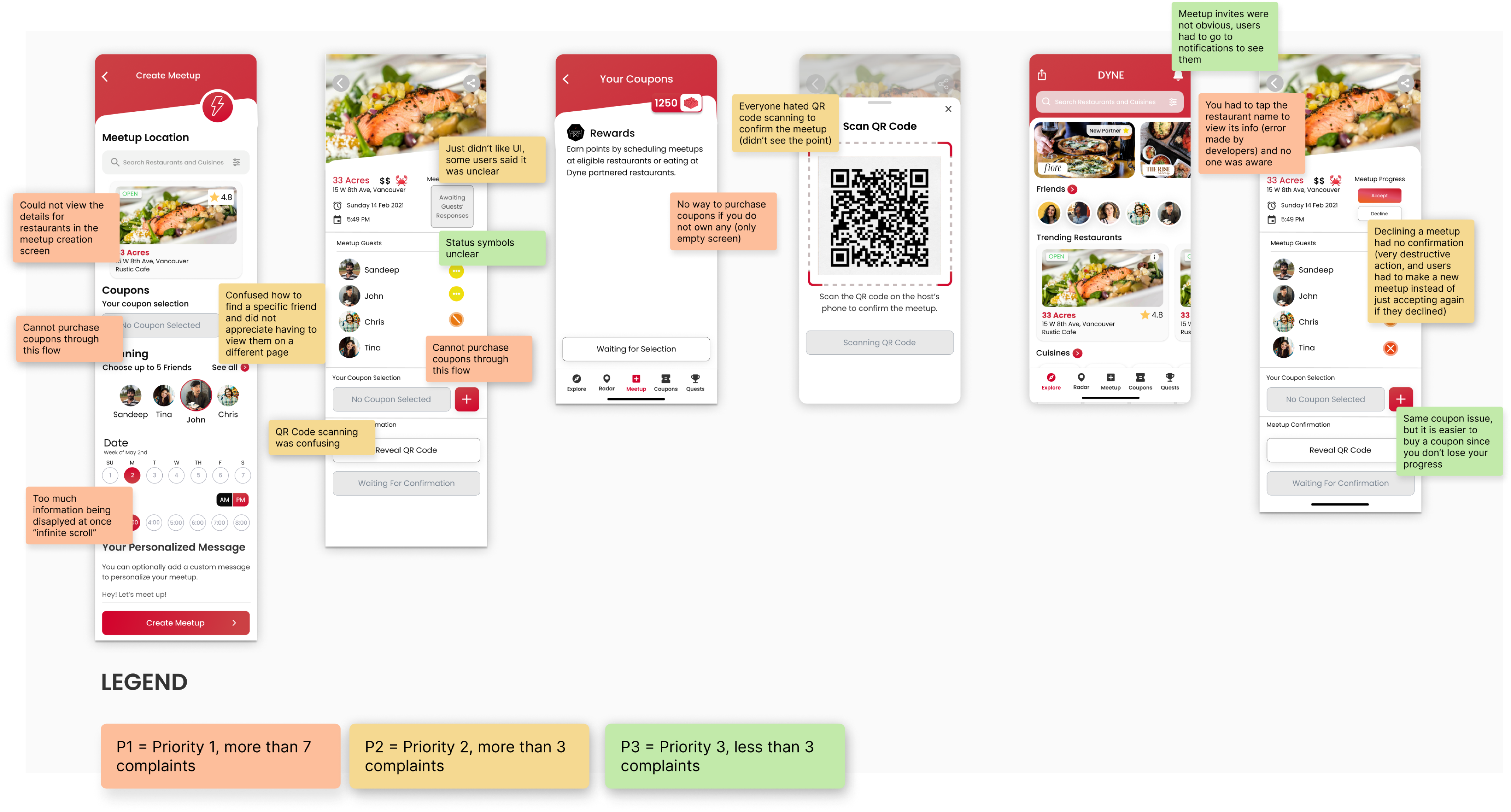
I ran usability testing sessions with both new and returning users, then mapped the findings to align stakeholders on where the flow was breaking down. Two patterns stood out:
01
New users struggled with information overload
Too much unfamiliar content was front-loaded into the first screen, causing hesitation and early drop-off.
02
Returning users often forgot to purchase a coupon beforehand
The system required a pre-purchased coupon to start a meetup. Users who missed that step had to restart the entire process, creating unnecessary friction and churn.

A TEDIOUS PROCESS
7 of 8 participants left the flow exhausted
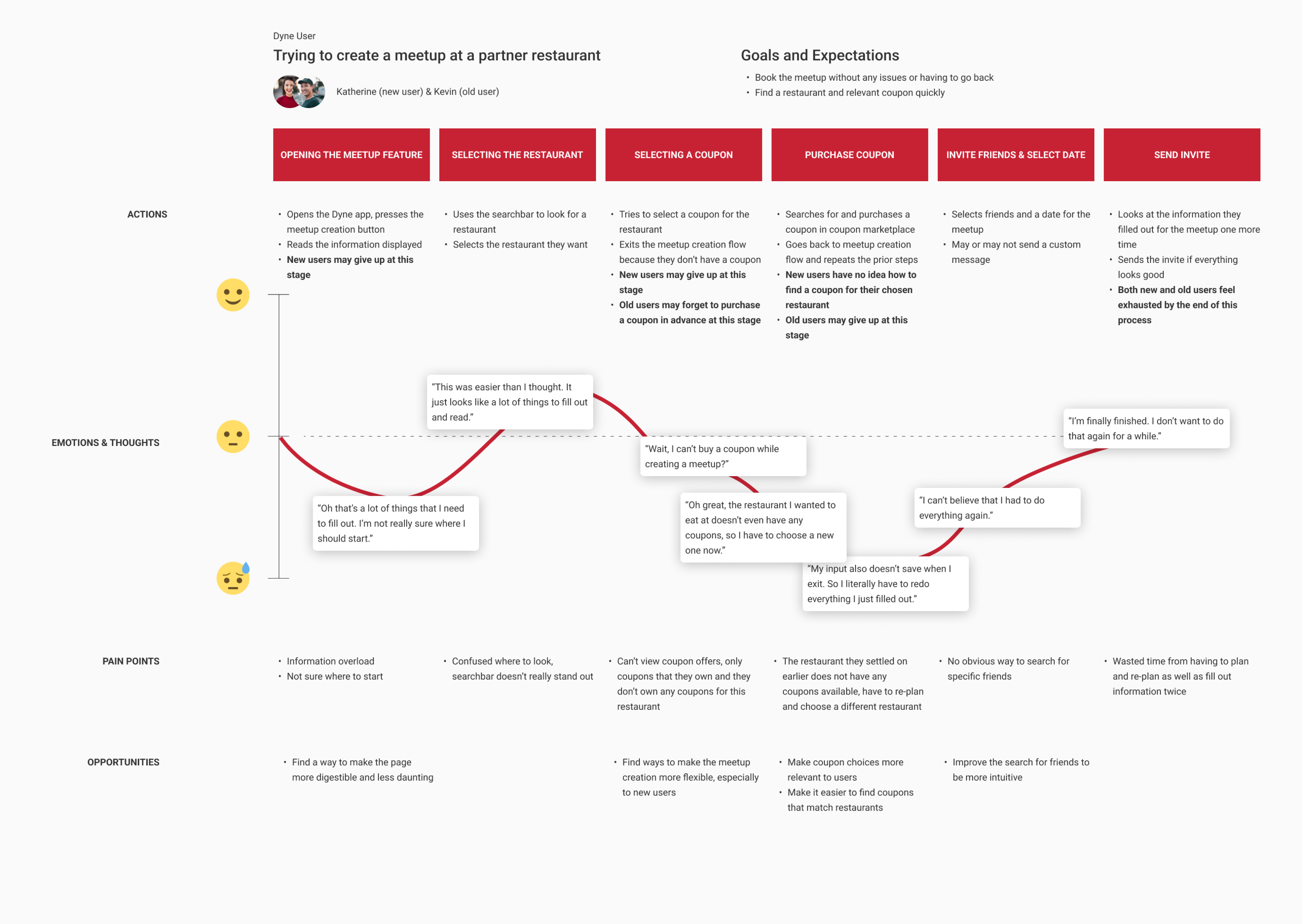
I created a user journey map to trace friction across both user types. Whether or not participants completed the flow, nearly all reported feeling frustrated and fatigued by the end.
New users dropped off most often during coupon selection and meetup creation.
They weren't aware a coupon was required before starting, which was especially confusing for first-timers.
Returning users dropped off after realizing they'd forgotten to buy a coupon.
Because the flow couldn't go backward, they had to start from scratch.
INITIAL SOLUTIONS
Interactive tooltips and in-flow coupon purchases
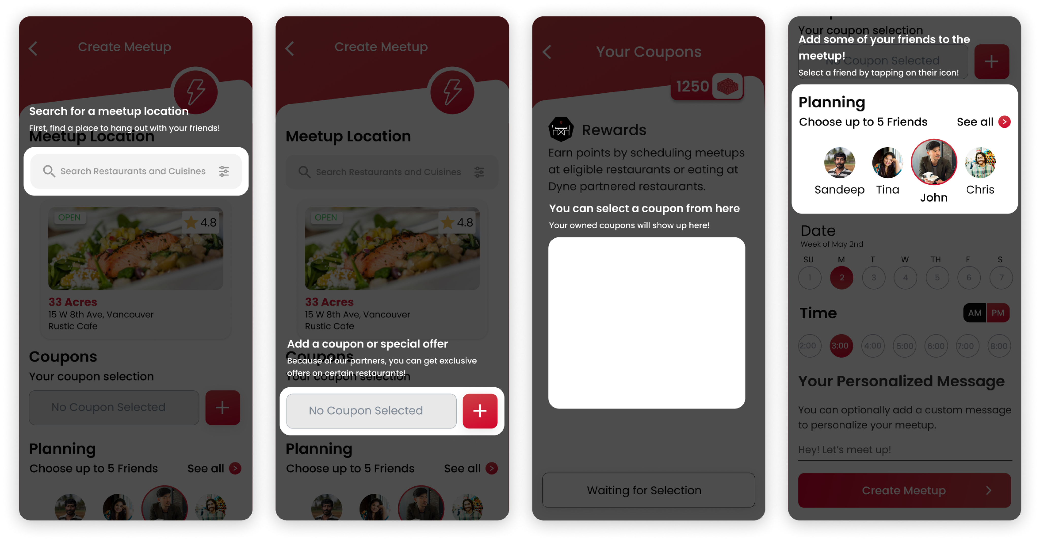
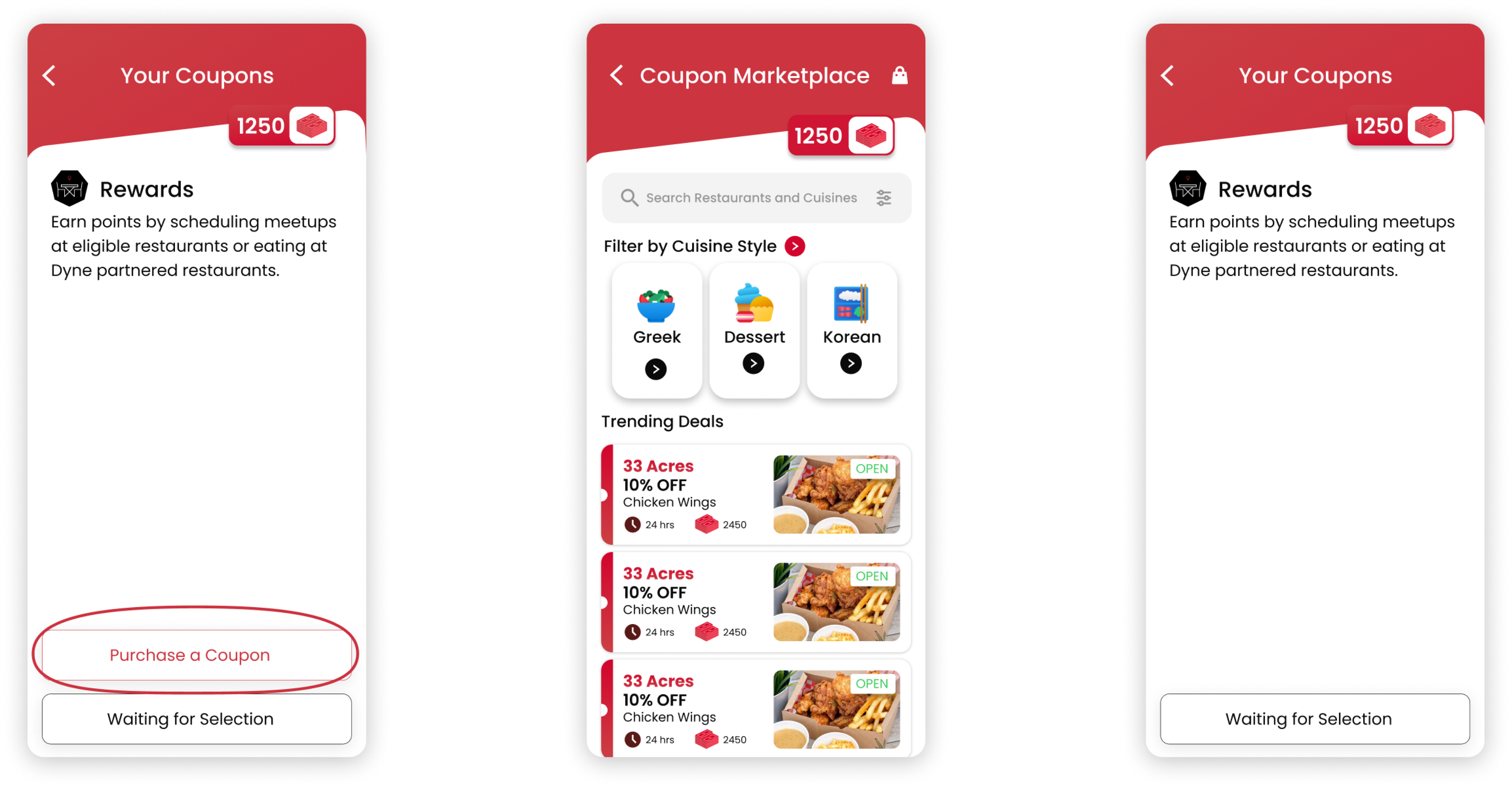
Rather than jumping straight into a full redesign, I proposed testing low-effort, high-impact fixes first: small changes needing minimal dev work that could still yield real usability gains.
01
Interactive tooltips
For first-time users, I designed step-by-step tooltips that guided them through meetup creation, reducing confusion and building confidence early.
02
In-flow coupon purchase
I designed this for returning users, letting them buy a coupon without leaving the meetup flow. Unexpectedly, it tested well with new users too: it made the whole process more forgiving.
BUILDING ON SUCCESS
Learning from an experience that's both simple and flexible: Instagram
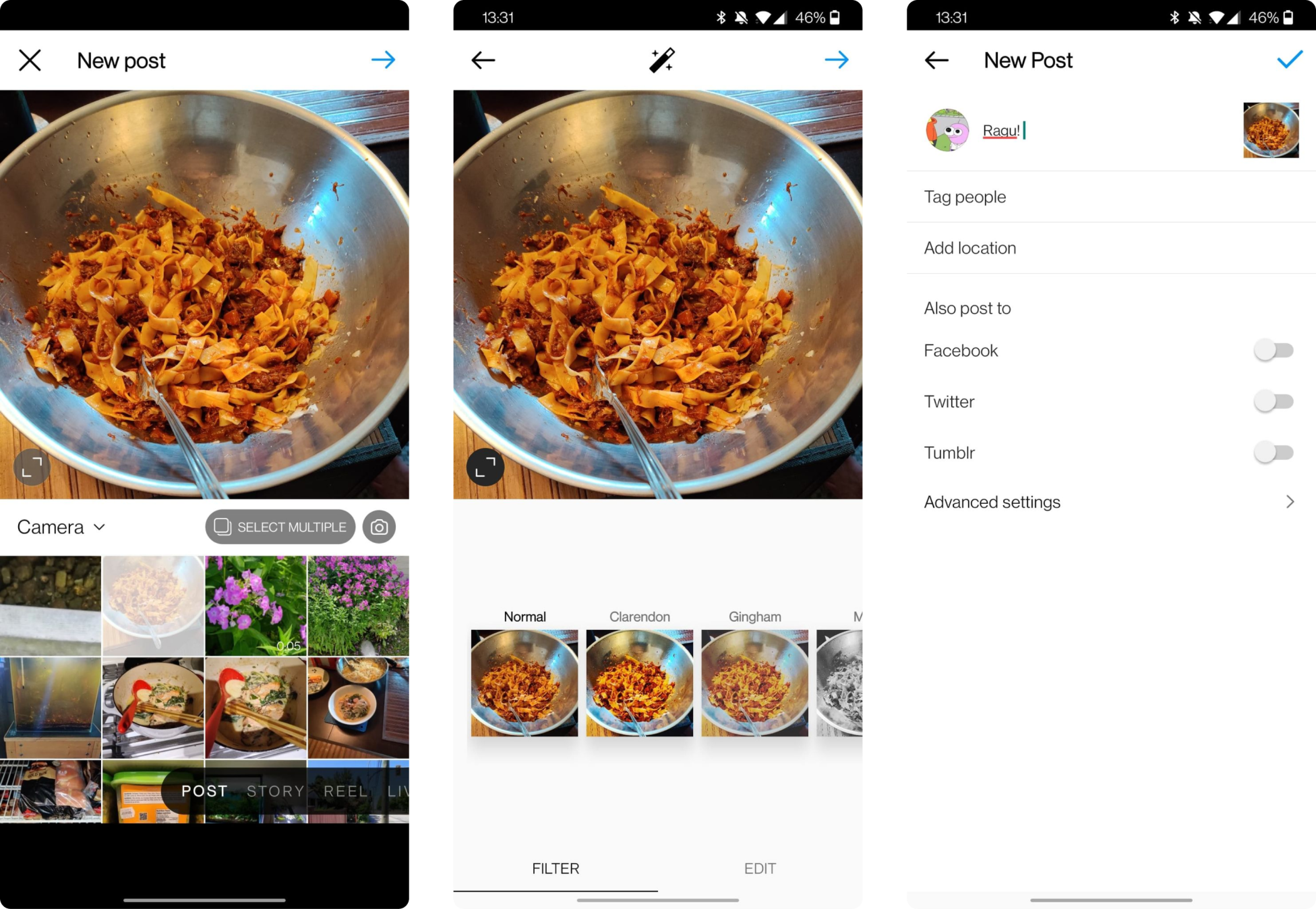
The quick fixes helped, but testing showed the underlying structure still overwhelmed users. I looked for a proven model and found it in Instagram's post creation flow, which embodied what our flow needed to be: clear, intuitive, and easy to complete.
Breaking down a complex process.
Instagram breaks post creation into smaller, bite-sized steps, making the experience feel shorter and more manageable.
Integration of related features
Key actions from other parts of the app (e.g. Stories) are integrated seamlessly, reducing the learning curve and avoiding duplicate work.
OUR TAKE ON IT
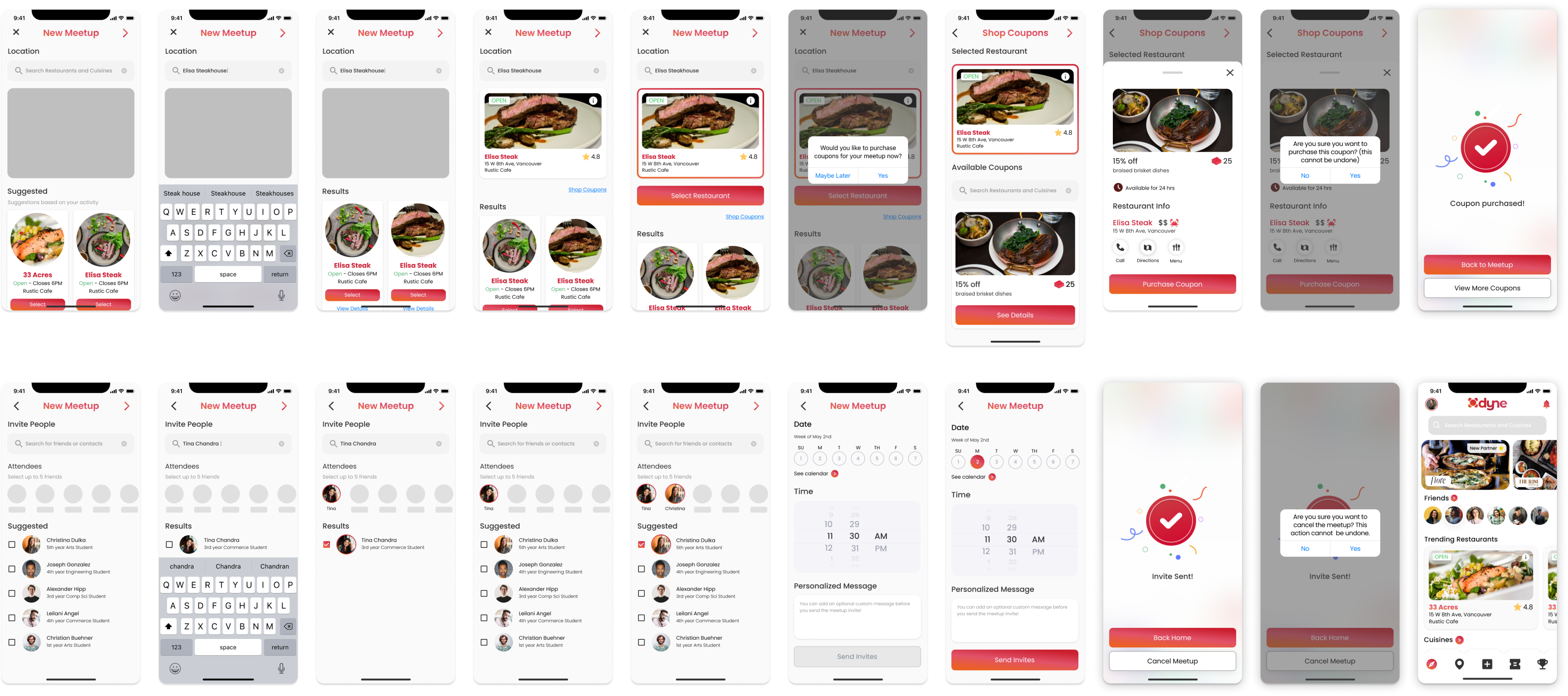
Solving two problems with one design
Modularization allowed us to simultaneously address both information overload and inflexibility, addressing pain points for both new and old users.
01
Smarter coupon purchases.
The first time the app was launched by a new user, we would guide them through the meetup creation process.
02
Clearer step structure.
This feature was catered more towards old users, but essentially it allowed them to purchase coupons while creating a meetup if they forgot. Surprisingly this tested well with new users also.

THE BOTTOM LINE
Real impact from thoughtful iteration
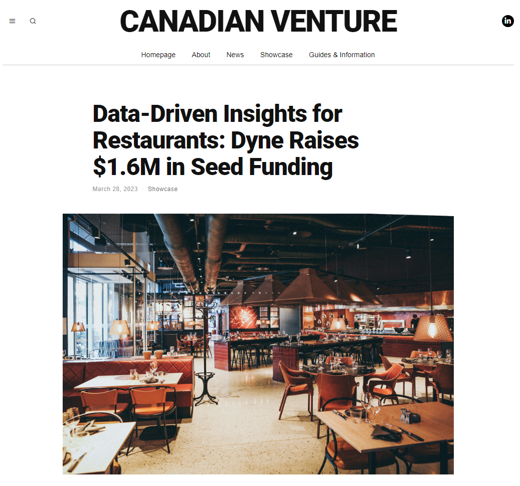
These engagement gains also fed into the company's story beyond the product: stronger mobile metrics were part of the traction Dyne presented to investors ahead of its $1.6M seed round.
23%
decrease in drop-off during meetup creation, within 3 months of launching the redesigned flow.
62%
increase in CSAT for the meetup experience among surveyed users.
REFLECTION
Three lessons I carried forward
Cheap experiments earn the right to redesign.
The tooltip and in-flow purchase tests didn't fully solve the problem, but they validated our diagnosis and gave stakeholders confidence to invest in the larger structural change.
I now default to "smallest test that could teach us something" before proposing a rebuild.
Fixes for one audience often serve another.
The in-flow coupon purchase was designed for forgetful returning users, but new users loved it too.
Forgiving design tends to be universal, a lesson I've carried into every flow I've designed since.
Borrowed patterns lower the learning curve.
Anchoring the redesign in a flow millions of users already knew (Instagram) meant users arrived with the right mental model for free.
If I did this again, I'd bring that competitive analysis in even earlier, before the first round of quick fixes.
Disclaimer: This case study represents my personal perspective on a design project I contributed to. My views are my own and do not necessarily reflect the views of Dyne Technologies Inc, its users, or its clients.
© 2025 by Jesse Li


Dyne Technologies
B2C Foodtech: Reducing drop-off by 23% using patterns from Instagram's post creation flow
Meetup creation was a key feature in Dyne's B2C app, letting users reserve tables at partner restaurants and unlock exclusive deals. Despite its value, the feature suffered from low adoption and high drop-off. This redesign was part of a broader initiative to improve onboarding and engagement.
Role
UX Designer
Team
1 PM, 2 iOS Developers, 1 QA Engineer
Timeline
1 Month
Problem
How might we make the meetup creation flow more accessible and forgiving for both new and returning users?
Outcome
23% decrease in drop-off
62% increase in CSAT
INFORMATION OVERLOAD
Mapping our key usability findings
I ran usability testing sessions with both new and returning users, then mapped the findings to align stakeholders on where the flow was breaking down. Two patterns stood out:
01
New users struggled with information overload
Too much unfamiliar content was front-loaded into the first screen, causing hesitation and early drop-off.
02
Returning users often forgot to purchase a coupon beforehand
The system required a pre-purchased coupon to start a meetup. Users who missed that step had to restart the entire process, creating unnecessary friction and churn.
A TEDIOUS PROCESS
7 of 8 participants left the flow exhausted
I created a user journey map to trace friction across both user types. Whether or not participants completed the flow, nearly all reported feeling frustrated and fatigued by the end.
New users dropped off most often during coupon selection and meetup creation.
They weren't aware a coupon was required before starting, which was especially confusing for first-timers.
Returning users dropped off after realizing they'd forgotten to buy a coupon.
Because the flow couldn't go backward, they had to start from scratch.
INITIAL SOLUTIONS
Interactive tooltips and in-flow coupon purchases
Rather than jumping straight into a full redesign, I proposed testing low-effort, high-impact fixes first: small changes needing minimal dev work that could still yield real usability gains.
01
Interactive tooltips
For first-time users, I designed step-by-step tooltips that guided them through meetup creation, reducing confusion and building confidence early.
02
In-flow coupon purchase
I designed this for returning users, letting them buy a coupon without leaving the meetup flow. Unexpectedly, it tested well with new users too: it made the whole process more forgiving.
BUILDING ON SUCCESS
Learning from an experience that's both simple and flexible: Instagram
The quick fixes helped, but testing showed the underlying structure still overwhelmed users. I looked for a proven model and found it in Instagram's post creation flow, which embodied what our flow needed to be: clear, intuitive, and easy to complete.
Breaking down a complex process.
Instagram breaks post creation into smaller, bite-sized steps, making the experience feel shorter and more manageable.
Integration of related features
Key actions from other parts of the app (e.g. Stories) are integrated seamlessly, reducing the learning curve and avoiding duplicate work.
Grouping related steps
By separating steps across clear, contextual pages, Instagram avoids overwhelming the user—while still guiding them through a cohesive task.
OUR TAKE ON IT
Solving two problems with one design
By modularizing the flow, I was able to address both major pain points, information overload and inflexibility, in a single structure that worked for new and returning users alike.
01
Smarter coupon purchases.
Beyond in-flow buying, I scoped coupon options to the selected restaurant only, cutting clutter and cognitive load.
02
Clearer step structure.
I grouped related actions into digestible stages, making the process easier to follow without sacrificing user control.
THE BOTTOM LINE
Real impact from thoughtful iteration
These engagement gains also fed into the company's story beyond the product: stronger mobile metrics were part of the traction Dyne presented to investors ahead of its $1.6M seed round.
23%
decrease in drop-off during meetup creation, within 3 months of launching the redesigned flow.
62%
increase in CSAT for the meetup experience among surveyed users.
REFLECTION
Three lessons I carried forward
Cheap experiments earn the right to redesign.
The tooltip and in-flow purchase tests didn't fully solve the problem, but they validated our diagnosis and gave stakeholders confidence to invest in the larger structural change.
I now default to "smallest test that could teach us something" before proposing a rebuild.
Fixes for one audience often serve another.
The in-flow coupon purchase was designed for forgetful returning users, but new users loved it too.
Forgiving design tends to be universal, a lesson I've carried into every flow I've designed since.
Borrowed patterns lower the learning curve.
Anchoring the redesign in a flow millions of users already knew (Instagram) meant users arrived with the right mental model for free.
If I did this again, I'd bring that competitive analysis in even earlier, before the first round of quick fixes.
Disclaimer: This case study represents my personal perspective on a design project I contributed to. My views are my own and do not necessarily reflect the views of Dyne Technologies Inc, its users, or its clients.
© 2025 by Jesse Li
Dyne Technologies
B2C Foodtech: Reducing drop-off by 23% using patterns from Instagram's post creation flow
Meetup creation was a key feature in Dyne's B2C app, letting users reserve tables at partner restaurants and unlock exclusive deals. Despite its value, the feature suffered from low adoption and high drop-off. This redesign was part of a broader initiative to improve onboarding and engagement.
Role
UX Designer
Team
1 PM, 2 iOS Developers, 1 QA Engineer
Timeline
1 Month
Problem
How might we make the meetup creation flow more accessible and forgiving for both new and returning users?
Outcome
23% decrease in drop-off
62% increase in CSAT
INFORMATION OVERLOAD
Mapping our key usability findings
I ran usability testing sessions with both new and returning users, then mapped the findings to align stakeholders on where the flow was breaking down. Two patterns stood out:
01
New users struggled with information overload
Too much unfamiliar content was front-loaded into the first screen, causing hesitation and early drop-off.
02
Returning users often forgot to purchase a coupon beforehand
The system required a pre-purchased coupon to start a meetup. Users who missed that step had to restart the entire process, creating unnecessary friction and churn.
A TEDIOUS PROCESS
7 of 8 participants left the flow exhausted
I created a user journey map to trace friction across both user types. Whether or not participants completed the flow, nearly all reported feeling frustrated and fatigued by the end.
New users dropped off most often during coupon selection and meetup creation.
They weren't aware a coupon was required before starting, which was especially confusing for first-timers.
Returning users dropped off after realizing they'd forgotten to buy a coupon.
Because the flow couldn't go backward, they had to start from scratch.
INITIAL SOLUTIONS
Interactive tooltips and in-flow coupon purchases
Rather than jumping straight into a full redesign, I proposed testing low-effort, high-impact fixes first: small changes needing minimal dev work that could still yield real usability gains.
01
Interactive tooltips
For first-time users, I designed step-by-step tooltips that guided them through meetup creation, reducing confusion and building confidence early.
02
In-flow coupon purchase
I designed this for returning users, letting them buy a coupon without leaving the meetup flow. Unexpectedly, it tested well with new users too: it made the whole process more forgiving.
BUILDING ON SUCCESS
Learning from an experience that's both simple and flexible: Instagram
The quick fixes helped, but testing showed the underlying structure still overwhelmed users. I looked for a proven model and found it in Instagram's post creation flow, which embodied what our flow needed to be: clear, intuitive, and easy to complete.
Breaking down a complex process.
Instagram breaks post creation into smaller, bite-sized steps, making the experience feel shorter and more manageable.
Integration of related features.
Actions from elsewhere in the app (e.g. Stories) are woven in seamlessly, avoiding duplicate work.
Grouping related steps.
Separating steps across clear, contextual pages avoids overwhelming the user while still guiding them through one cohesive task.
OUR TAKE ON IT
Solving two problems with one design
By modularizing the flow, I was able to address both major pain points, information overload and inflexibility, in a single structure that worked for new and returning users alike.
01
Smarter coupon purchases.
Beyond in-flow buying, I scoped coupon options to the selected restaurant only, cutting clutter and cognitive load.
02
Clearer step structure.
I grouped related actions into digestible stages, making the process easier to follow without sacrificing user control.
THE BOTTOM LINE
Real impact from thoughtful iteration
These engagement gains also fed into the company's story beyond the product: stronger mobile metrics were part of the traction Dyne presented to investors ahead of its $1.6M seed round.
23%
decrease in drop-off during meetup creation, within 3 months of launching the redesigned flow.
62%
increase in CSAT for the meetup experience among surveyed users.
REFLECTION
Three lessons I carried forward
Cheap experiments earn the right to redesign.
The tooltip and in-flow purchase tests didn't fully solve the problem, but they validated our diagnosis and gave stakeholders confidence to invest in the larger structural change.
I now default to "smallest test that could teach us something" before proposing a rebuild.
Fixes for one audience often serve another.
The in-flow coupon purchase was designed for forgetful returning users, but new users loved it too.
Forgiving design tends to be universal, a lesson I've carried into every flow I've designed since.
Borrowed patterns lower the learning curve.
Anchoring the redesign in a flow millions of users already knew (Instagram) meant users arrived with the right mental model for free.
If I did this again, I'd bring that competitive analysis in even earlier, before the first round of quick fixes.
Disclaimer: This case study represents my personal perspective on a design project I contributed to. My views are my own and do not necessarily reflect the views of Dyne Technologies Inc, its users, or its clients.
© 2025 by Jesse Li